Expressing gratitude with gentle colors. Mother’s Day table decorating tips with Eriko Shirakawa.
eterble has asked space creative professionals with a variety of perspectives on how to make a rich table space, ideas, and its techniques. In this volume we spoke with Eriko Shirakawa, a food space producer who has created spaces in a variety of locations, from private homes to commercial facilities and clinics.
She talks about the Mother’s Day themed table decorations she created for the eterble’s pop-up event this May.
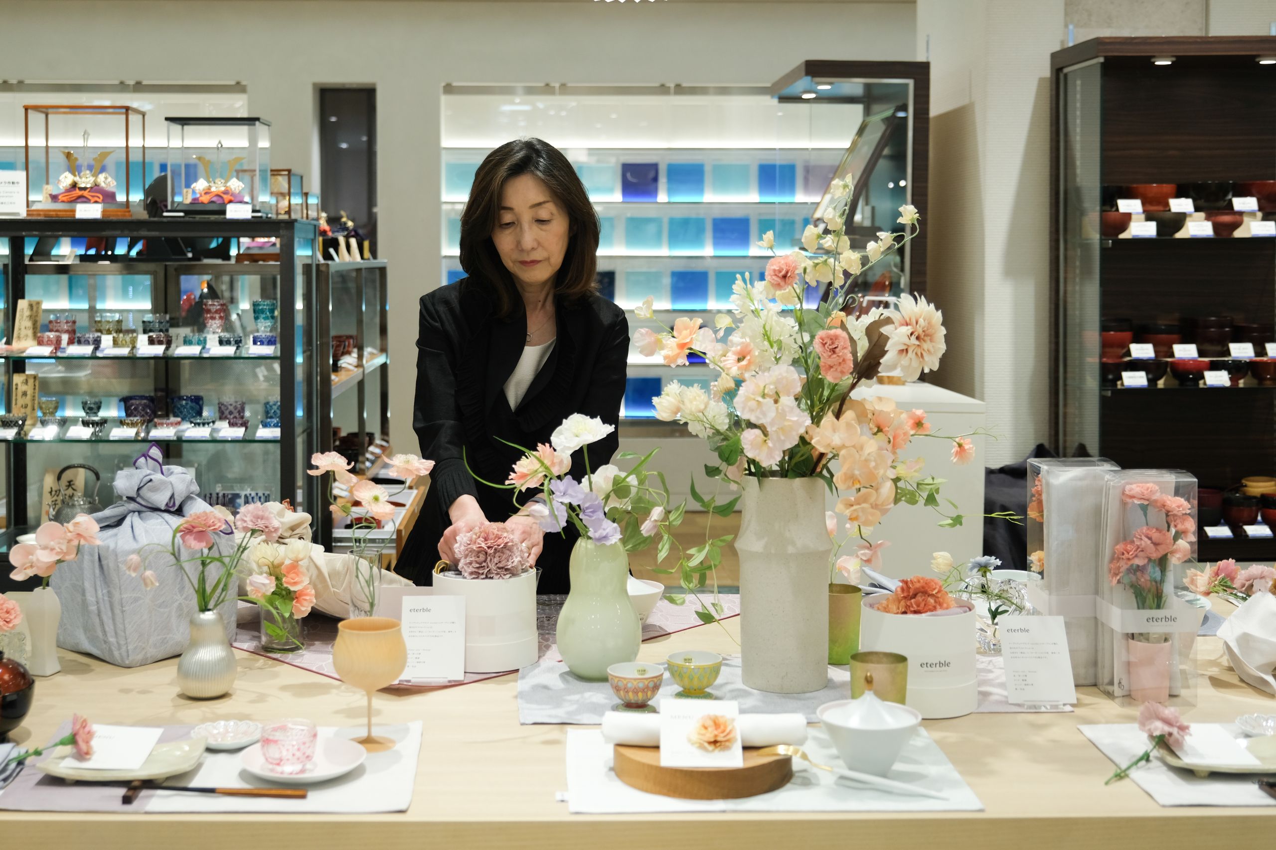
ーYou took part in exhibiting your table coordination, themed around “Mother’s Day” at eterble’s pop up event. What were some of the points you focused on?ー
For this exhibition, I focused on “luncheon mats” and “furoshiki-sized tablecloths.
First, the luncheon mats…
Many families enjoy Mother’s Day by having their husbands and children cook and decorate flowers to show their appreciation for their mothers.
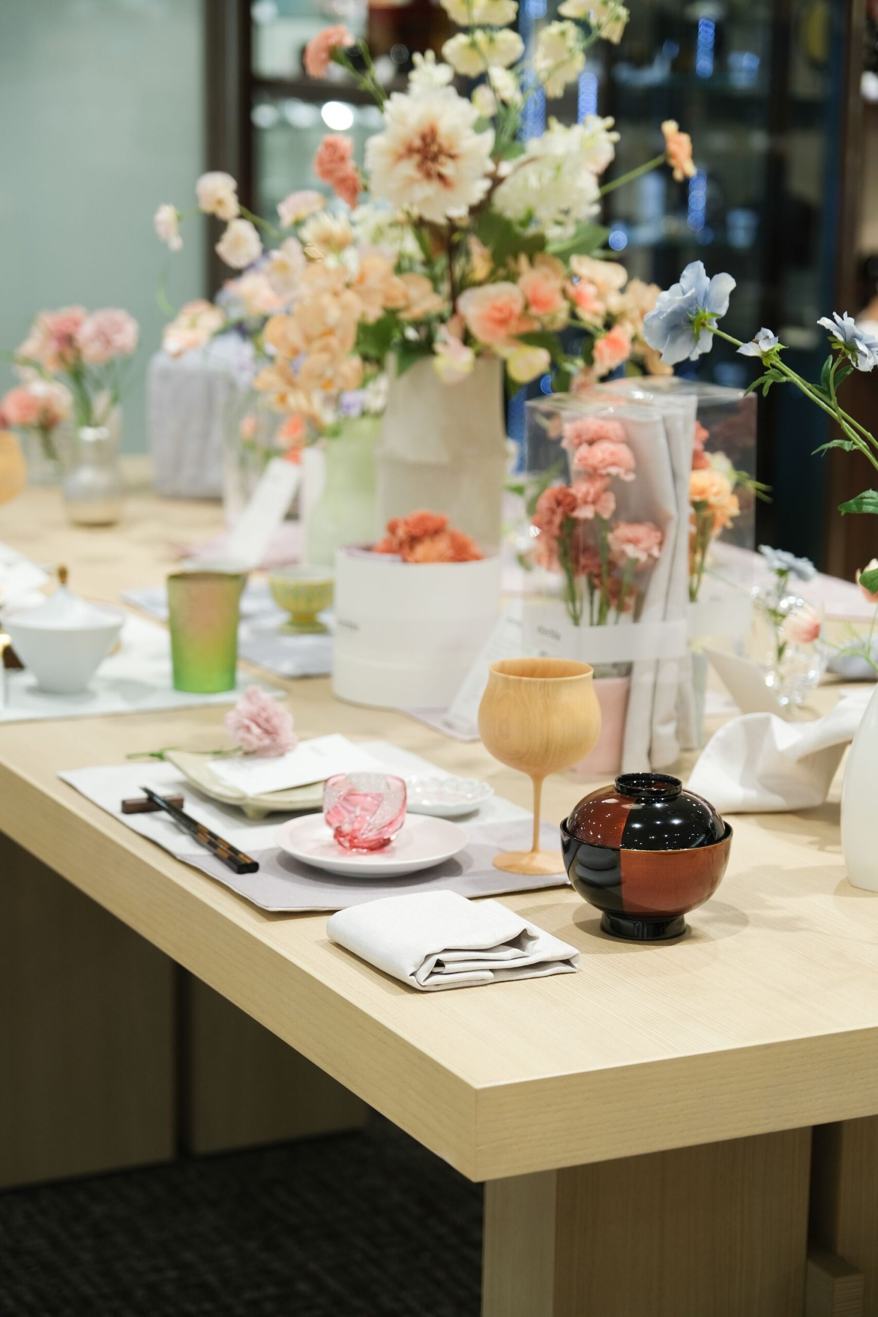
I have shown three variations of how to use luncheon mats, which are very useful for such events.
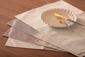
First is the “Japanese” theme. eterble’s luncheon mats can be used for Japanese and Western cuisine, as well as tea time, in any setting. As for the “Japanese” theme, I chose the same tableware for both sides and used both sides of the reversible tableware. The mildly colored luncheon mats went well with the tableware, even when used in a random arrangement of two colors.
The second is as a table centerpiece. While a single sheet can be used as a table centerpiece to complement the items placed on it, using multiple sheets, as in the Japanese layering technique, is also a fun and sophisticated way to use it.
And third, as a table accessory, we matched it with a bread basket. Laying it out is not only functional in terms of hygiene, but also fashionable.
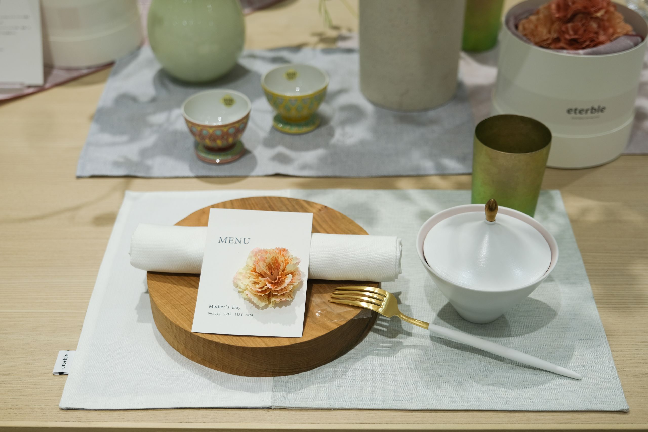
memoria Luncheon mat/a reversible luncheon mat fits any scenes
Next is “Sintra”, a Japanese furoshiki-sized tableclothes.
The geometric patterns inspired by tile decorations in Portuguese cities are woven into the fabric, and the delicate colors and patterns emerge beautifully from different angles and under different lighting conditions.
“Plum” color way, which debuted exclusively at Mitsukoshi department, is exactly right for a “Mother’s Day gift,”. I styled it with a lovely gift box.
I also did the now popular furoshiki wrapping, “hana-wrapping” and “enchanted ribbon-knotting”. The “Hana Wrapping” is wrapped around a stacked box, but it is a very tasteful item to bring to a potluck and enliven the table.
I chose “Peach Fuzz,” as the theme color for the entire table, which is this year’s PANTONE trend color. I hope that the Mother’s Day table, and those who view my table coordination, will smile gently at the light hues of the flowers.
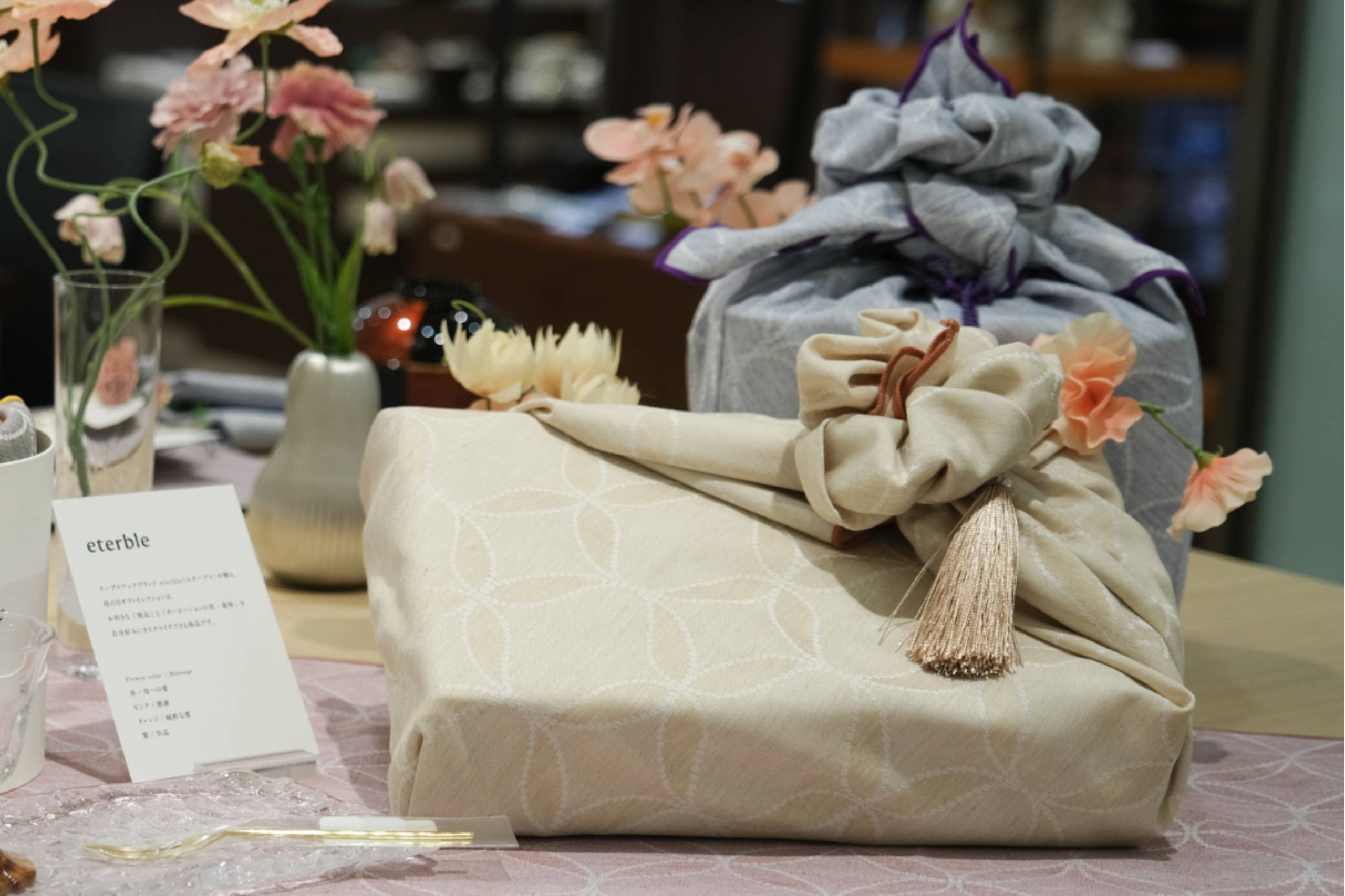
Sintra/Japanese “furoshiki-sized” tablecloths
ーHow was it like coordinating with eterble linens?ー
I had a hard time choosing the right linen, but I narrowed down the theme color to something in a peaceful color.
All of the combinations are beautiful and go well with dishes and glasses of various colors and materials, and we enjoyed coordinating them. The high quality materials also go well with the artist’s tableware and lacquerware, and seem to further elevate the table.
ーWhat did you find attractive about eterble?ー
I first encountered eterble when they exhibited at “Interior Lifestyle 2023,” and I couldn’t help but stop in their stylish booth.
I was drawn to the casually stylish designs and trendy linens in nuanced colors. I was also surprised and moved by the yarn on display, which, I learned, is made from upcycled tablecloths.
I think it is wonderful that eterble is planning and developing tablecloths in consideration of the environment, from the manufacturing process to the sewing and wrapping of the tablecloths.
As a user, I would like to choose products that can contribute to the earth as much as possible.
In addition, we heard that you have been nominated for an award in the sustainability category by Dezeen, an architecture and design magazine from the UK. I think that is wonderful.
The texture of the natural material is so pleasant to the touch and supple that it is hard to believe that it is recycled yarn, making it a very pleasant object to place around you every day.
It is nice to know that our daily lives are surrounded by nice things that suit our sensibilities. The wide variety of colors is also appealing in that you can find deep colors and subtle grayish tones that suit a variety of styles and complement the vessels.
ーDid you find any items you liked at eterble? If there is an item that you would like to use for yourself or as a gift, please let us know along with the reason why.ー
The reversible “memoria Luncheon mat/Memoria” will be useful for Japanese, Western, and Chinese meals, breakfast, lunch, and dinner.
I would love to gift “sand sage” and “grayish sand” in different colors for wedding celebrations and couples. The mild colors go well with any combination and make the table more festive.
The “flor lithuania linen Luncheon mat,” which was inspired by the colors of Lithuanian flowers, is also of high quality and looks like it will become more textured as it is used.
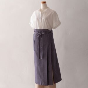
Outside of this exhibition, I fell in love with the “eterble life Sommelier apron” at first sight. Handsome and elegant. It is indeed designed with ease of movement and women’s body shape in mind. It will be very useful for work and also for home parties with friends.
Profile

Eriko Shirakawa
FSPJ certified instructor and coordinator.
Based in Ginza, Tokyo, FSPJ provides full-featured and professional table coordinating services.
In addition to teaching at the FSPJ Table Coordination School, she has worked as an interior decorator for many years, creating spaces for private residences, model homes, and commercial facilities.
