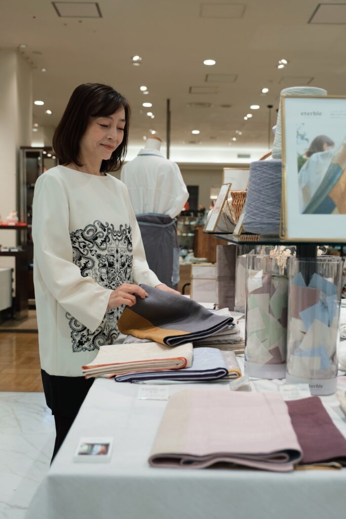
The clue to color selection is in the space: ask interior stylist Makiko Miyamoto how to choose a theme color.
In this series of interview, eterble asked space creation professionals with a variety of perspectives about how anyone can create a rich table space, ideas, and techniques. For this interview, we spoke with Makiko Miyamoto, an interior stylist.
Makiko, who is involved in displays for commercial facilities and model rooms, shares her techniques for creating spaces that can be incorporated into the home.
ーWhat should we consider when choosing a tablecloth for the first time?ー
If you are going to use it in your home, it is a good idea to pick up a theme color from the room or the entire space.
It would be a shame if only the tabletop floats, so it would be a good idea to choose a color that links with the rest of the interior, such as matching the color of the curtains, or if there is a sofa nearby, matching the color of the cushions, etc., to bring the space together.
If the curtains are patterned, it is a good idea to select one color from the colors in the pattern, and so on.
A tablecloth that covers the entire table may seem easy to use, but for beginners, it is actually a bit of a hurdle. I think it would be easier to start with a luncheon mat or table runner, and then add color accents to the table.

ーNow move on to the accent colorー
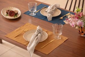
I like the eterble’s plain luncheon mats that are available in variety of colors.
The atmosphere fits both Western and Japanese styles, and the materials are of high quality. For example, it goes well with elegant glassware on top, and conversely, it goes well with the rustic Scandinavian atmosphere of ceramics, making it easy to match a variety of styles.
I personally like the Blue and the Yellow.
Blue may seem difficult to match at the dinner table, but it goes very well with items made of natural materials, such as wooden trays. Wooden tray with beige surface would blend in too well and lack impact. A little bit of blue makes it all the more stylish.
eterble’s Blue color is similar to “Japanese indigo”, which is familiar to the Japanese and very easy to use.
ーFrom an interior stylist’s point of view – using eterbleー
I very first used the eterble’s tablecloths at a tableware events last year. I was surprised and could not imagine from the actual texture that it was made of recycled material. Whether styled in Japanese or with a Western feel, eterble cloths give the impression of accepting both.
Personally, I like the shades.
As an interior stylist, I find it difficult to match tableware with colors that have a strong statement. eterble provides the color ways in trendy gray tones and natural colors, making it easy to match them to the overall interior and living space.
At first glance, the texture looked natural and dusty, but I was surprised by its beauty when illuminated. As someone involved in commercial facilities and spatial displays, this kind of lighting appearance is also a pleasing point.

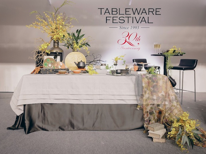
A show table coordinate Makiko has styled at “Tableware Festival 2022”
.
.

Profile:
MAKIKO MIYAMOTO
FSPJ certified instructor, coordinator, interior stylist.
Her work includes displays for commercial facilities and hotel spaces, styling for magazine shoots, and interior accessory stylist for condominium model rooms. She specializes in the selection and styling of interior goods, and is skilled at proposing a variety of styles and seasonal displays.
Instagram|@space_and_deco
